Summary
Role
lead designer, in collaboration with the design system squad
Target Users
all users across the platform
Design Problem
Responsivity (Overflow Handling & Component Variants specifically)
Context
In an organization-wide accessibility review, our platform had been flagged with a high amount of critical issues, and 12% of those related to page header. I partnered with the Design System squad to design a new responsive and accessible page header component. Soon I figured we didn’t have a standard approach for responsive design, which hindered us from maintaining consistency and creating predictable interactions across the platform.
As a result, here are the objectives I set out for this project:
- Identify responsive design problems in the Page Header component
- Formulate a framework to holistically approach responsive issues in the design system
- Assess impacts to improve understanding about the importance of responsiveness within the organization
Design Process
Approach the Problem Space
With some help from an Automation Engineer to gather page screenshots, I conducted a pattern analysis on over 100 page headers spanning across 11 major product areas. From there, I abstracted the structure of the Page Header component, and assigned the child-components into different levels of specificity based on the Atomic Design framework.
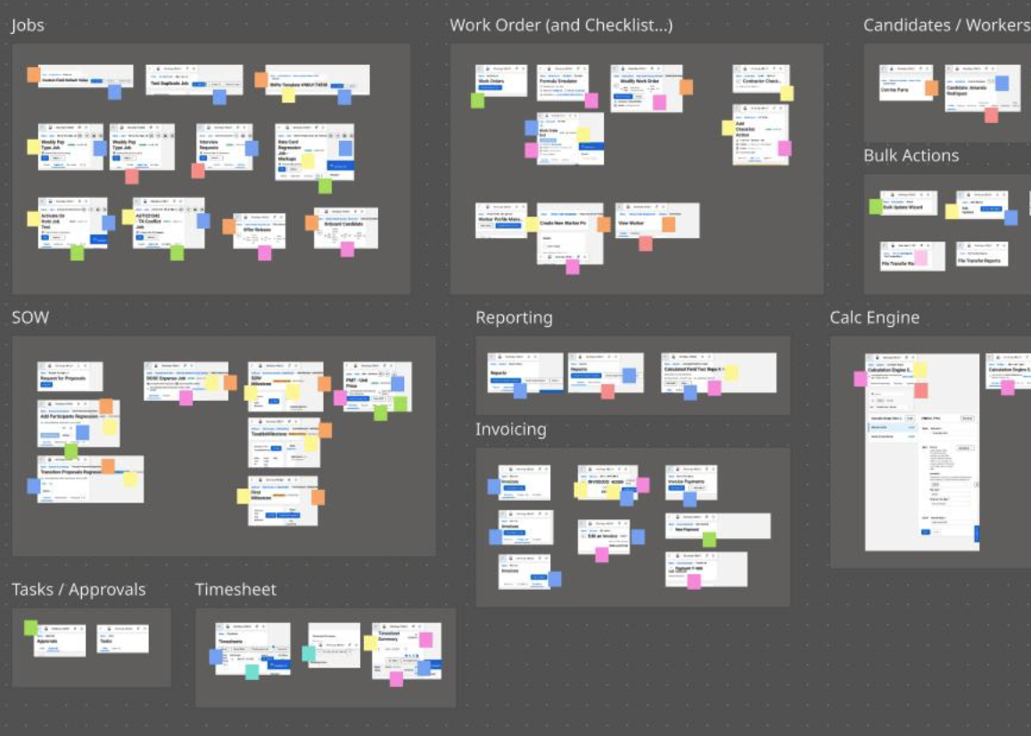
THE PATTERN ANALYSIS
images as data. I used color sticky notes to tag the exceeding content (overflow) and how it was handled. By doing so, I was able to assess the severity of inconsistency and identify where the responsive problem came from, whether it was the layout, or the UI elements, or the texts. The answer was “yes.”
After identifying the common needs for a page header, I abstracted the UI elements to regional areas and mapped them to the atomic structure.
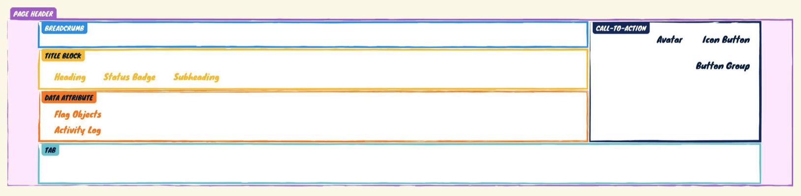
THE ANATOMY
The Page Header container was an organism. Each section inside, such as Title Block and CTA, was a molecule. Each element inside a section, such as Heading & Button Group, was an atom. This concept is relative, the role a component plays may change depending on the level of specificity I’m trying to solve for. For example, the Button Group could be an atom here, and an organism in a different context.
Through pattern analysis, I identified and prioritized these 2 responsive problems:
- Responsive layouts being handled in such an inconsistent, unstructured way; and
- Typography & component variants not optimized for smaller screen sizes
Small Changes Matter
Language is a powerful tool in shaping and shifting people’s minds. Recognizing the misconception, and sometimes lack of awareness, about responsive design within the organization (responsive = desktop + tablet + mobile, no one would use feature X on mobile, etc.), I went to explain the harm of device-specific verbiage: making responsive design an optional add-on, specific to certain features or devices, leading to de-prioritization of accessibility efforts.
I then introduced more inclusive terms, such as “compact devices” and “smaller screen size.” This has helped remove the device-specific excuses and reframe conversations among the leaderships to adapt responsive layouts across the entire platform.
Design The Guideline
To systematically approach responsive layouts, I came up with a simple principle for the team to follow: go from outside to inside. This means to wrap the container, to treat exceeding content, or to truncate texts, from the outermost level of a structure.
For example, our designers frequently use multiple Flag Object components to provide users with additional data points of an object; these flag objects are typically grouped together. When there is limited screen estate, the width of the group container (the outermost level) is sized down, so the exceeding flag object should be wrapped to the next line first, then followed by the text elements.

THE doc 1
How to handle overflow for data attribute components, such as Flag Object Group and Activity Log.
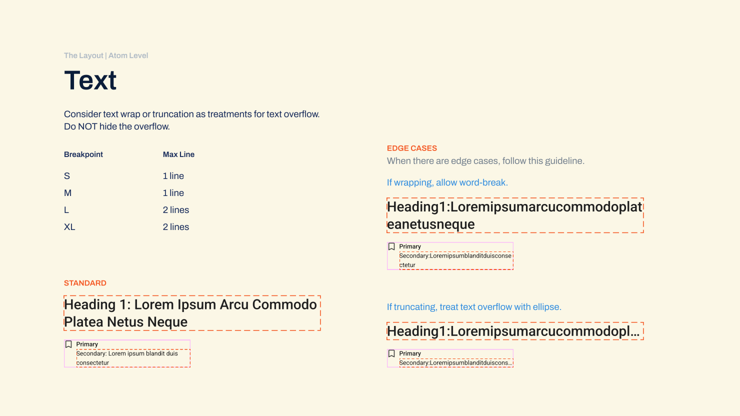
THE doc 2
How to handle overflow for text components, such as Heading in the page title and Secondary Text in a flag object. This guide also called out edge cases like unusually long strings and provided instructions for when text-wrap or truncation was needed.
Next, to optimize typography and component variants for different screen estates, my principle was to look from the smallest unit.
For example, the Page Header component has a button group; a button group contains one or many Button components. To create a small variant for the Page Header component to use in smaller screen sizes, a designer should consider using the smaller versions of the Button components.
The Problems with Typography
From the accessibility standpoint, our system page title needs the H1 tag. And in our old design system, Heading 1 was the only typography style that was built with an H1 tag. This led to a misconception within the Design team (which had manifested in a previous iteration of the page header design) that the page header would have to use Heading 2 or 3 if we wanted to reduce the font size on smaller screen sizes.
However, text style and text hierarchy are 2 separate dimensions. We may use different style combinations for the same type hierarchy, where appropriate. With that foundation knowledge, I renamed the heading text styles (from Heading 1…3 to Heading XS…XL) and introduced a few more styles with a proportional scale in font size. That said, the page title can use the extra-large style on a wide screen and the medium style on a more narrow screen.
This has helped remove the misconception among the team, and enabled more flexibility in styling different heading text components.
Bring Everything Together
After setting the foundation and getting alignment, the Design System squad and I decided to move forward with the V1 of this guideline. With additional support from a UI engineer, I have successfully defined the responsive behavior for the Page Header component, from the layout to child elements.
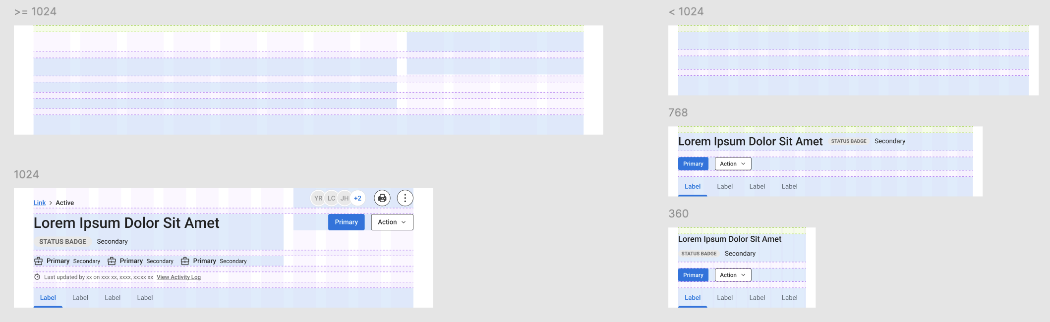
THE LAYOUT PROTOTYPE
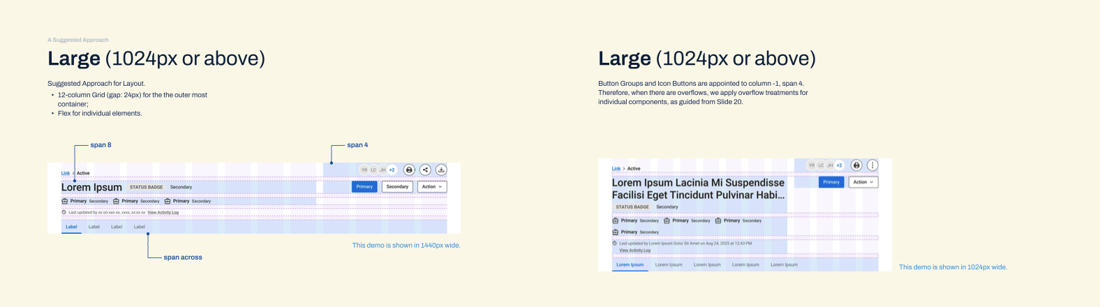
Prototype doesn’t need to be an interactive series of screens. Here I abstracted the child elements and positioned them onto the 12-column grid layout, to see how much space each of them had as the parent component scaled up and down.
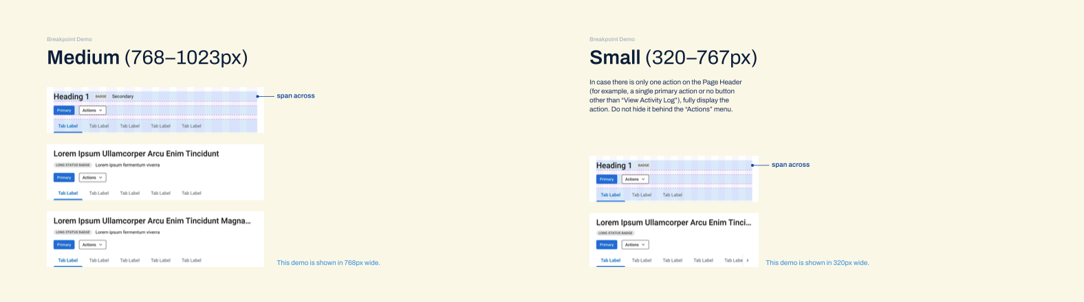
I tested with both flex and grid, and found grids giving me greater control over different regions. In this case, on wider screen sizes (≥ 1024px), we specifically needed the button groups to stick to the right edge of its container, while not “eating up” the horizontal space of the page title. An 8/4 layout could accommodate those requirements and give out a balanced look for the overall structure. On narrower screen size (< 1024px), simplifying the UI elements and letting them span across their container were a more appropriate approach.
THE hand-off
including the grids and examples for how to handle overflows at different breakpoints