Summary
Role
designer, in collaboration with 2 senior designers and a product manager
Target Users
Staffing Specialist & Contingent Program Specialist
Design Problem
Efficiency & Scalability
Context
Completing onboarding checklists is a crucial part of the hiring and onboarding process. Workday VNDLY allows customers to set up custom checklist items and assign them to staffing specialists, who are responsible for submitting onboarding requirements on behalf of their candidates. Program specialists on the customer side will then review the submissions and confirm the candidates are clear to start.
The contingent staffing industry is characterized by short turn-around times, typically 24–48 hours, along with an extremely high worker population. Therefore, a design that could improve the efficiency of the onboarding process would be beneficial for both staffing and program specialists. Beside that, exploring a scalable layout to accommodate customizations was also on the radar.
Design Process
Establish An Information Architecture
In prior experience, users can simply complete these checklist items through a modal, by entering required data and uploading supporting documents. As Workday VNDLY grows to support global programs, customers now need the ability to add more instructions and custom data fields for different variants of a single checklist item.
As more information was introduced, complexity increased, creating more cognitive load on users when going through the information and completing the items, which in return would decrease productivity. To address this, I analyzed the interaction pattern and sorted out different types of data points related to the workflow.
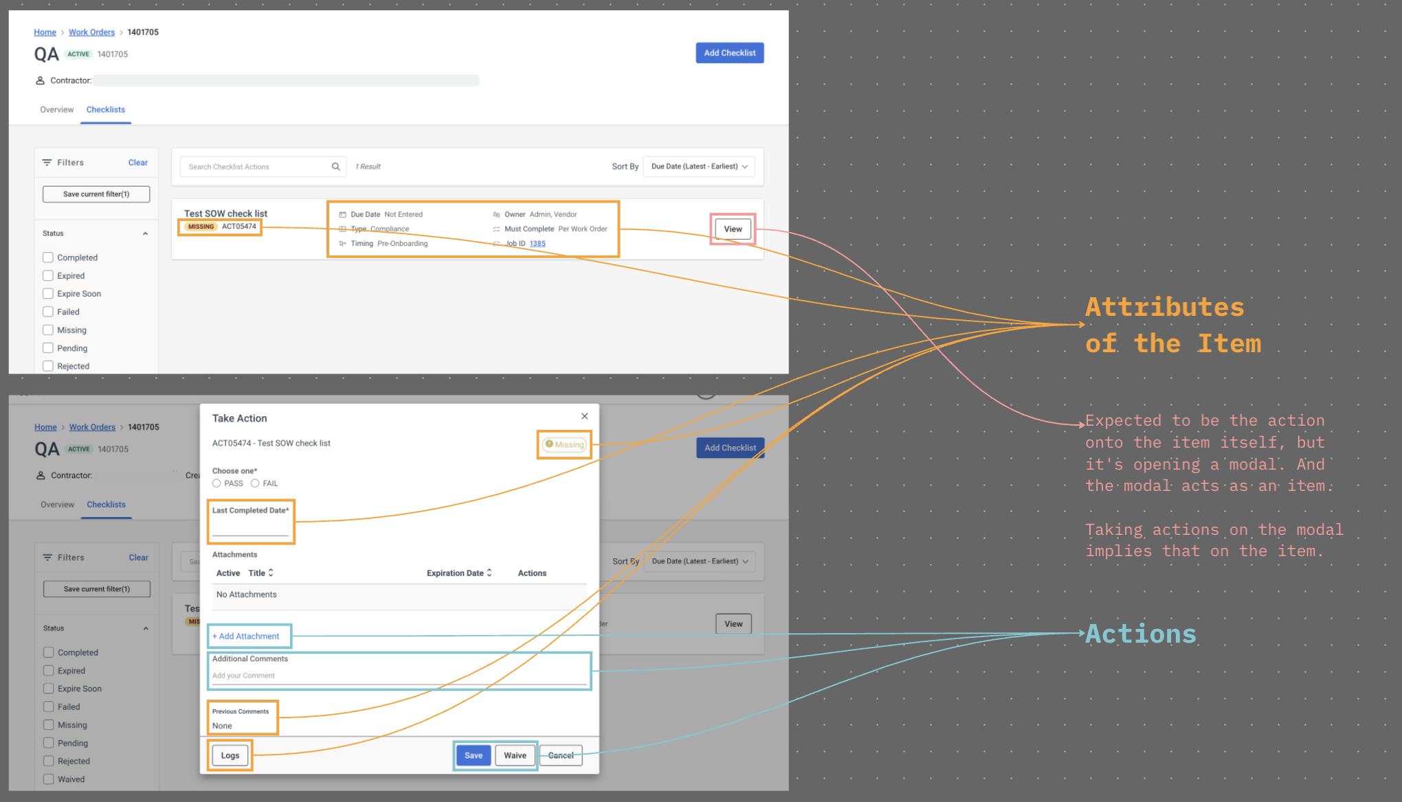
THE INTERACTION MAP
The “View” button on the list item was used to open a modal, and the modal now acted as the list item. A user had to take action on the modal while their intention was to take action on the item itself. These redundant interactions created unnecessary cognitive load onto users.
It appeared that the interactions were inconsistent and the information was very unstructured, so I came up with a new information architecture to better communicate what the supporting data was and what users needed to do.
Decide on A Layout
I followed and supported a senior designer to conduct experience review, concept validation, and internal interview with functional consultants. From this research, we learned that users perceived onboarding checklists as tasks. This insight guided our design approach: the layout needed to feel familiar and align with patterns found in productivity tools that our target users already use in their daily workflows.
I created a moodboard to analyze the design pattern of different task-related softwares. And we decided to move forward with the split layout for 2 main reasons: (1) to be consistent with both our Workday ecosystem and other productivity tools in implementing the Tasks concept, and (2) to reduce the cognitive load created by the redundant actions and information.
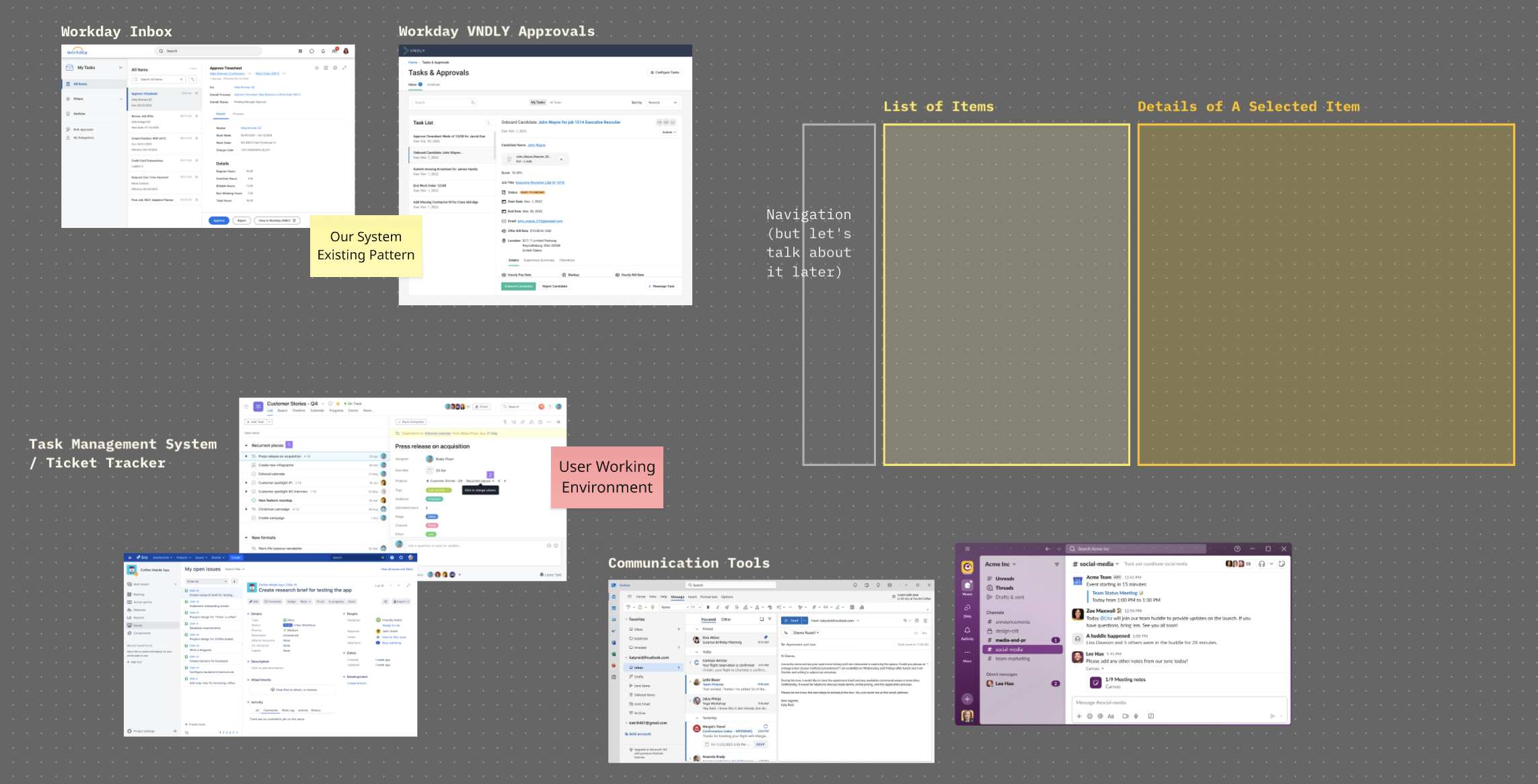
THE ANATOMY STUDY
Snapshots of task management systems, such as Workday Inbox, VNDLY approvals, Jira, Asana, and communication tools like Slack and Outlook. All of them had a list of items on the left-hand side, and a detailed view on the right-hand side. The detailed view contained necessary data for a user to make decisions and take action on the item directly.
Bring Everything Together
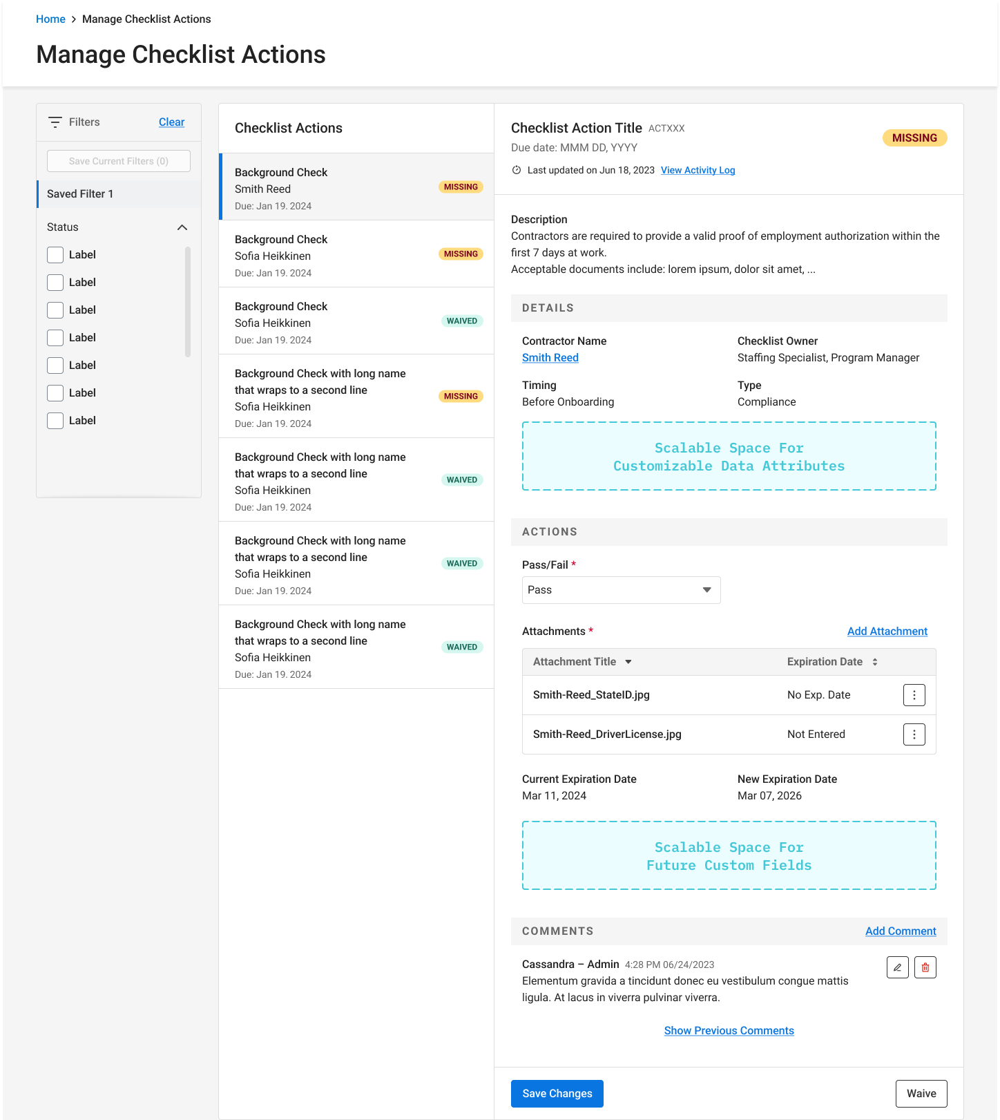
Connecting the new information architecture and design layout together, I have brought the concept of “Onboarding Checklist as a Task List” to live!
THE DESIGN
onboarding checklist as a task list.
This design enables users to view details of items by navigating through the list on the left-hand side, reducing the cognitive load and redundant action created by the original “View” button. By restructuring static information and actions into 2 separate sections, the design helps users know what to focus on in order to complete their onboarding requirements. The detail view on the right-hand side allows more scalable spaces for customizations, preventing the modal from growing and being scrollable.
The design reused components from our design systems, with a little tweaks to the document uploader to accommodate the needs of this product. To support engineers in handling varied user permissions and form validations, I worked with the product manager to define scenarios and included developer notes & design variants in the hand-off file.
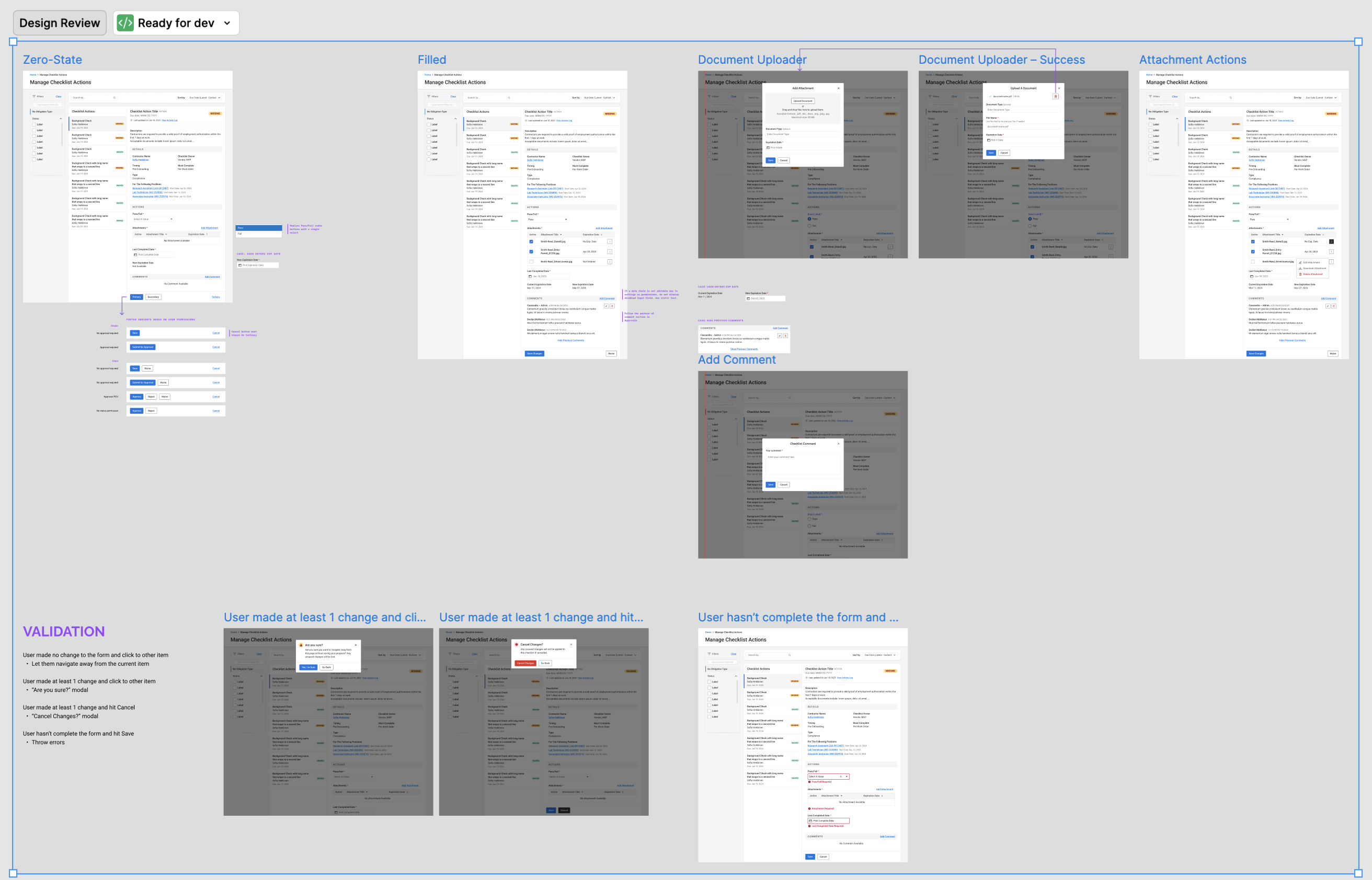
THE HAND-OFF CANVAS
simple and straightforward, including clear use cases with a design variant for each use case, demonstration of a new design for document uploader, and instructions on what alert components to use based on different form validations.